Signal through the noise

Illustrating the effect of noise on a linear regression

Marc T. Henry de Frahan

This educational Shiny app illustrates the effect of noise on a linear model.

  • Linear regressions are often used to model complex effects.
  • Data measurements always have some associated noise.
  • It is important to understand how the noise effects the fit quality.

We provide an educational app to explore the effect of Gaussian random noise.

Instructions and guidelines

The objective is to fit the following expression with a linear model: \[y_i=x_i + \varepsilon_i \qquad \text{for}~i = 1,\dots,n\]

where \(\varepsilon_i = \mathcal{N}(\mu, \sigma)~\text{for}~i = 1,\dots,n\).

We provide the user with three sliders:

  • the number of points \(n\) (our measurements);
  • the mean of the Gaussian random noise, \(\mu\);
  • the standard deviation of the Gaussian random noise, \(\sigma\).

The linear model is illustrated via a plot and the \(R^2\) value is provided as a measure of the quality of the fit.
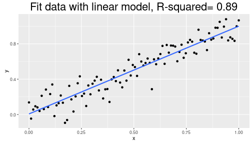
With \(n=100\), \(\mu=0\), and \(\sigma = 0.1\), the quality of the fit is good.

fit <- lm(y ~ x, data = df)
r2 <- summary(fit)$r.squared
ggplot(df, aes(x,y)) +
    geom_point() + geom_smooth(method = "lm", se = FALSE)+
    ggtitle(paste("Fit data with linear model, R-squared=", format(r2,digits=2))) +
    theme(plot.title = element_text(size=22))

plot of chunk lm-plot

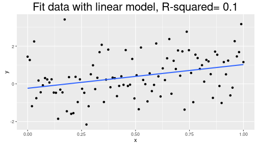
If \(\sigma\) is large (\(= 1.2\)), \(R^2\) is low (poor fit).

fit <- lm(y ~ x, data = df)
r2 <- summary(fit)$r.squared
ggplot(df, aes(x,y)) +
    geom_point() + geom_smooth(method = "lm", se = FALSE) +
    ggtitle(paste("Fit data with linear model, R-squared=", format(r2,digits=2))) +
    theme(plot.title = element_text(size=22))

plot of chunk lm-plot2